Get a Free Consultation

Design Harmony Achieved : Draivin

About this Product

Users will contribute to increasing the efficiency of the transportation network by providing up-to-date information on the state of the roads, which will help to avoid traffic congestion and problems such as potholes, roadblocks, and street closures. The application has an interaction system between users, where they can answer questions from visitors and doubts from other users, by selecting a point on the map. In addition, a system of moderators has been implemented, assigned by the application, who have privileges to edit and delete reports, and who are selected based on their experience and number of moderators in the area.
The final output and design we obtained for Draivin’s mobile application and website

Our Role

Team

Tools

Timeline

Discover

Overview:  
Master Creationz  is a Top UI UX Studio In India specialising in  user interface (UI) and user experience (UX) design for digital products. They have been approached by a client with specific requirements regarding the look and feel, color scheme, and design elements for their project. This case study outlines the process followed by Master Creationz to meet the client’s expectations and create a cohesive and visually appealing design.

The Problem :
Our Client Dravin approached us with their product of rental cab service and cab insurance service and wanted us to create a website and mobile application meeting their below stated requirements

Client Requirements :


Look and Feel:

  • The design elements should follow a consistent style throughout the project.
  • Arrows, icons, and typography should harmonize and create a cohesive experience.
  • Design elements used in one part of the project should be carried over to other sections for consistency.

Color Scheme:

  • Corporate colors should guide the design without overpowering it.
  • Orange used in buttons (CTAs) should be replaced with colors from the color palette.
  • Purple is proposed as the primary color, with minimal use of gradients.

Typography:

  • Montserrat bold is the main typography for titles and main communications.
  • Open Sans is the secondary typography for paragraphs and other text.

Design

Design Process:  

Understanding the Requirements:
  • We held initial discussions with the client to gain a thorough understanding of their vision and objectives. They clarified specific design preferences, the desired tone, and the target audience for the project.
Look and Feel:
  • Based on the client’s requirement for a cohesive design, we developed a design concept that incorporated rectangular icons with pointed corners. This design element would be consistent across the project, from the landing home screen to the footer. By ensuring visual continuity, users would have a seamless experience.

Colour Scheme:

  • We proposed using a purple color palette while focusing on full shades to avoid overwhelming users. We suggested minimizing the use of gradient colors, reserving them for specific use cases. This approach would create a clean and minimal look and feel.

Typography:

  • Keeping the client’s preference in mind, we selected Montserrat bold as the primary typography for titles and main communications. This font choice added visual impact and complemented the design. For paragraphs and other text, we recommended using Open Sans, which provided legibility and readability.
Design Iterations:
  • We created multiple design iterations based on the proposed concept, color scheme, and typography. They applied the new colors, ensuring the absence of orange throughout the screens. Titles were predominantly styled with a combination of purple and black, with purple used selectively to emphasize key words in the text.
Minimal and Clean Communication:
  • To fulfill the client’s requirement for minimal and clean communication, we strategically placed design elements to avoid overwhelming users. They ensured that the design conveyed information quickly and clearly, facilitating user understanding.

Deliver

By following the client’s requirements and design guidelines, we successfully developed the Draivin app and web platform for our client. The design achieved a consistent and cohesive look and feel throughout the application. The purple color palette, minimalistic design, and careful typography implementation created an intuitive and visually pleasing user experience. The final product aligned with the client’s vision of a clean and simple solution that effectively communicated their car rental services.
Here are a few insights of the mockups we created in the process.

Outcome

Hoping the you enjoyed viewing our design journey with our client Draivin ! To take a deeper Dig at our work with Draivin please visit their website.

You Imagine it, we Create it
It's Original and Rare

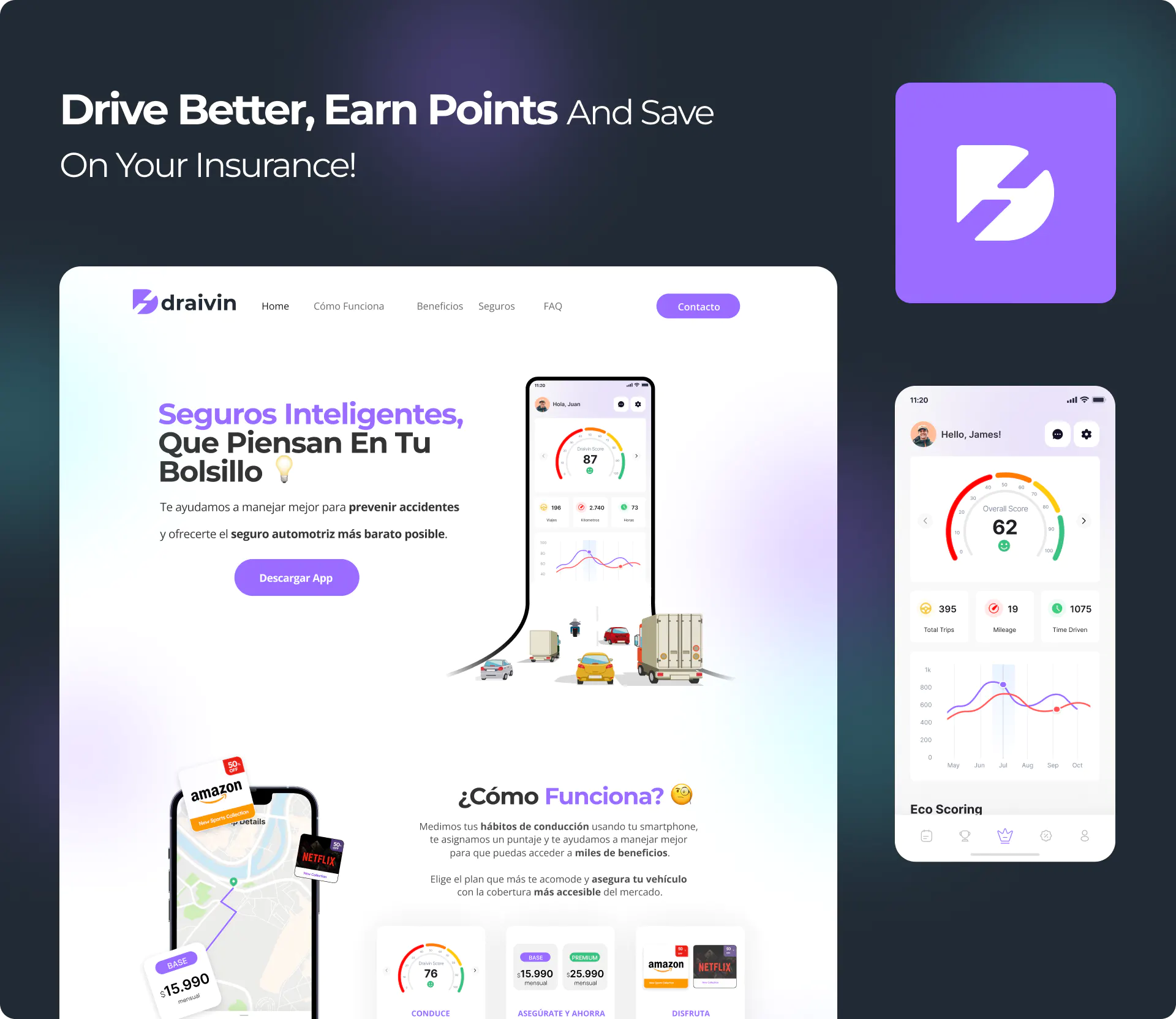
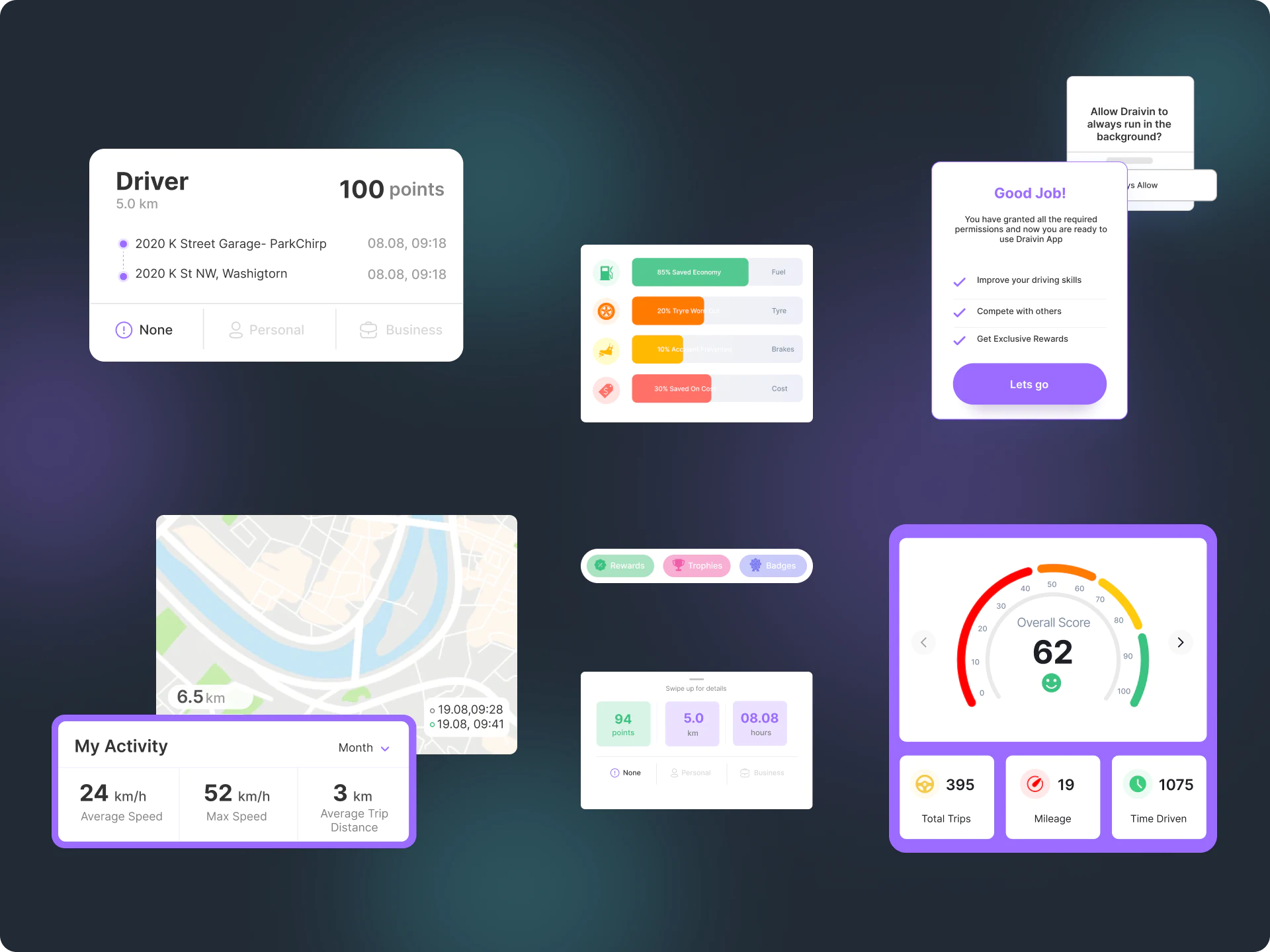
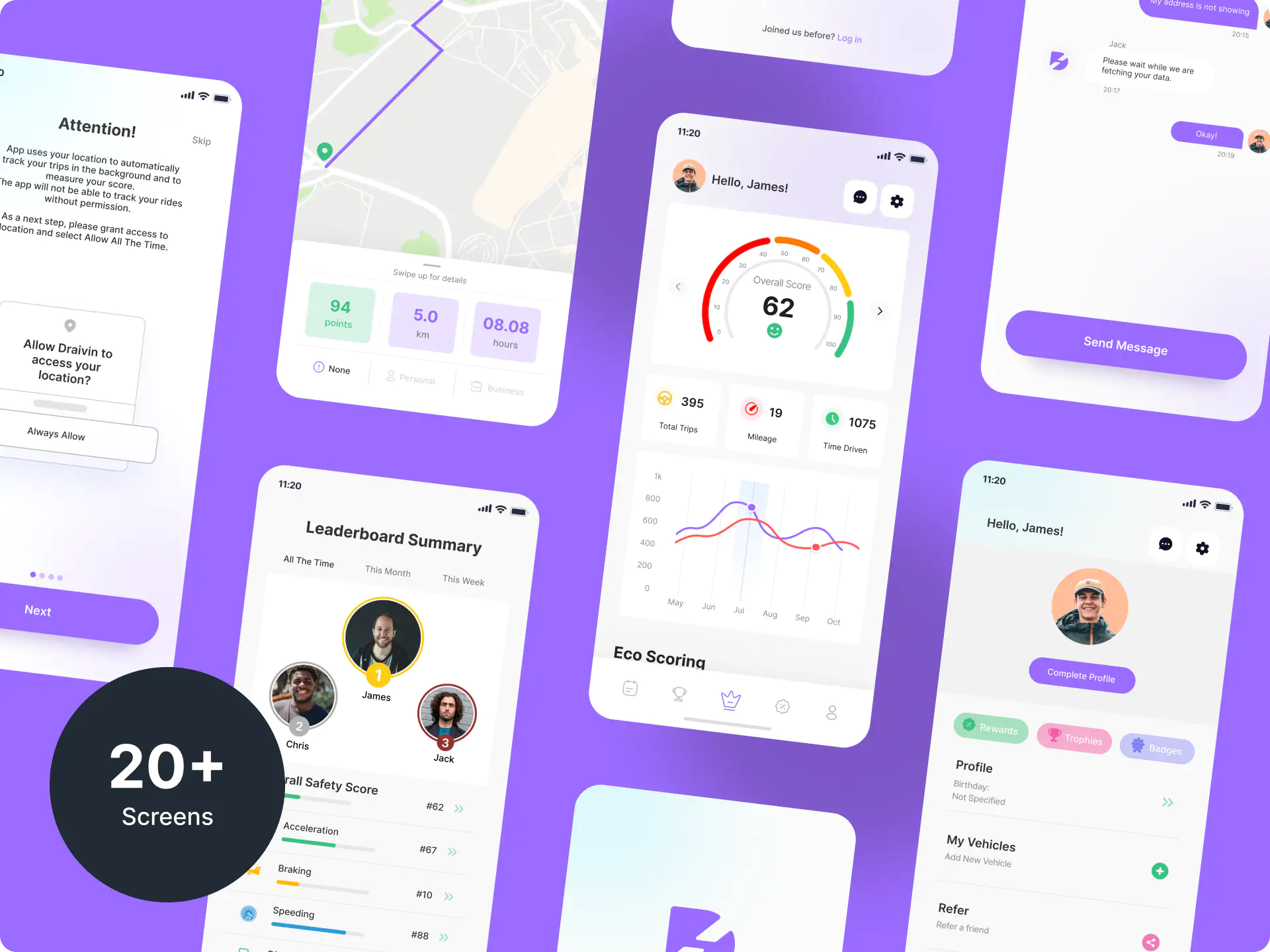
As a full-service UI/UX agency we work closely with our clients to define & design user experience across all platforms. We’ve so far worked with over 500+ clients and have received 5-star ratings with 100% client satisfaction.

Back